Hi. I noticed recent changes to the wiki, though there wasn't an announcement post made, or much less a vote like we used to do for these sorts of things. I chalked it up to admin decisions, and just ignored it.
That said, today I come to find out these were all voted for in the Discord, that not all wiki users, use. Not only that, but the wiki's admins I talk to regularly didn't know about the change until it already happened.
That said, layout wise, I might as well give my opinion in hindsight, since I couldn't before the implementation.
It sucks.
That isn't to say the work our admins put into it sucks. They have done a great job on the wiki, and that can't be denied. It isn't to say their work isn't appreciated. But it's a matter of some issues with the current theme, that the old one just didn't have.
There, I got that out of the way. Though I should probably give my reasoning.
So, running down what's irking me with those images, top to bottom...
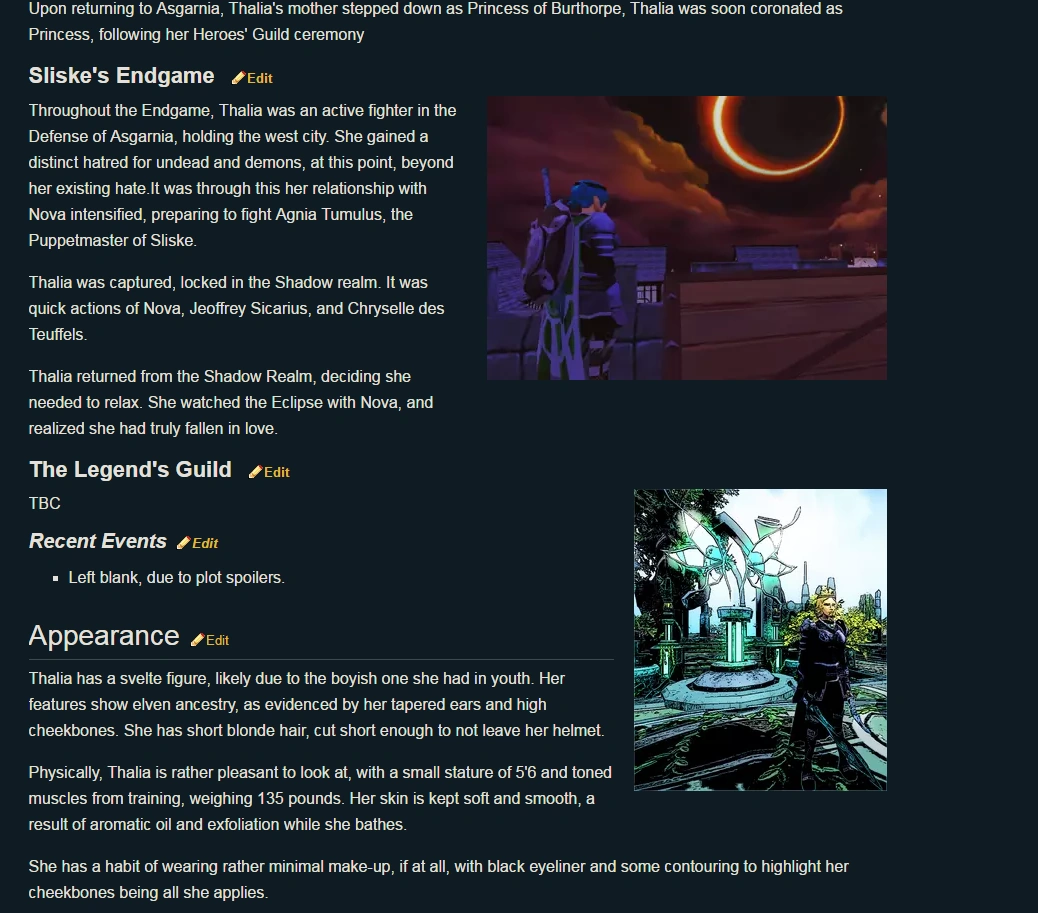
I won't deny it, the Eclipse picture looks great! It's part of the reason I scrolled down to include it, because what goes right has just as much place here. But the other one on Thalia's page, the main image of her in her armour, is detailed in such a way to give a slight inky vibe. Like someone drew it into a story, rather than shooting for raw, beautiful shots in NXT Ultra. With the beige background, I could get a little artsy with this.
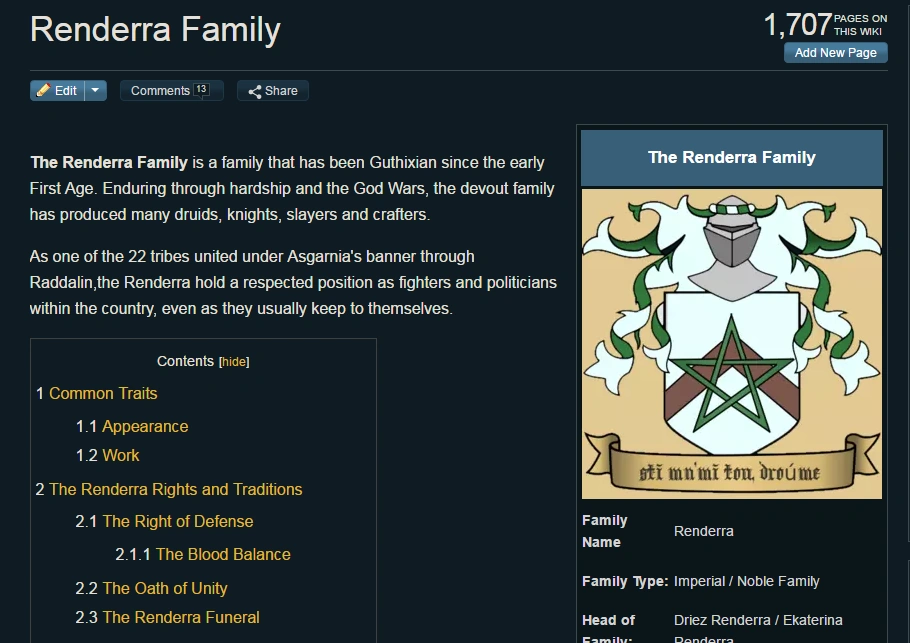
The second, the Renderra page, is another ball of wax. The beige background that is there is admittedly, my fault for not making it transparent. But the white, now surrounded by the darker Wiki text looks way too bright, especially since it's a pretty pure shade for a coat of arms, and not something that you come across ingame. Heraldry tends to lean to bright, pure colours to be more distinguishable.
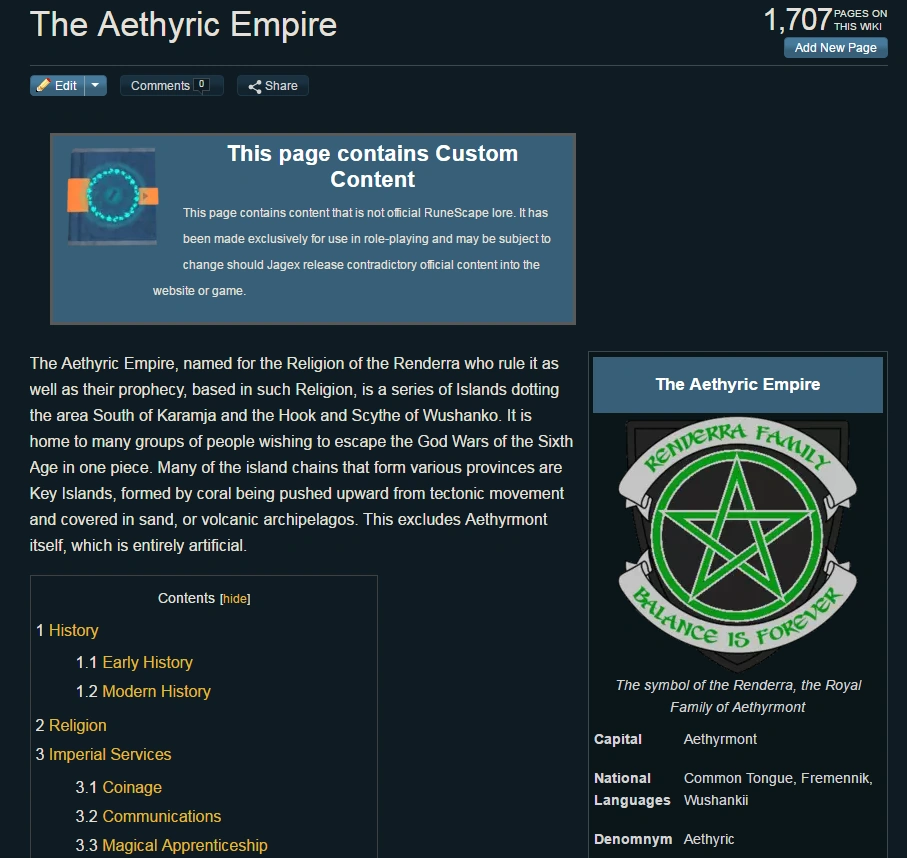
The Third image, using the Old/Not Asgarnian Renderra colours, is a mess for another reason. The new wiki theme is so dark, you really need to focus on the image to see the shield is present, indicating it's heraldry.
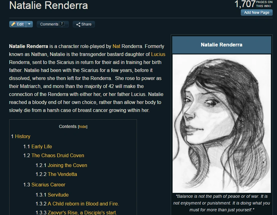
Finally, the fourth page... Natalie Renderra's. The bright white clashes with the new theme, but since this is a sketch, removing the white means there is now just black, blending into our new theme. There's no way to keep Tibby's excellent detail in, without the white seeming to jump off the page too much.
Now, I'm going to point out a few other pages that come to mind.
Bloody Apple - The Beige works well with the theme, because it is easy to read in this case. The dramatics of the theme have a hard time clashing with the simplicity of the images by the bottom, but the ones by the top run into an issue of dramatic and dark colours once more. Similar can be said for issues of The Gielinor Times that use the text.
Hayley K. Spears - The art, being wonderfully hand-drawn, is suffering from white sheet syndrome and sticks out.
Some of the templates for articles are painfully bright, as well. The Zamorak one comes to mind, with how the bright red clashes with our new, dark blue theme. This is an easy fix though, so nothing too big.
The big issue is the theme and images. If the current theme is set into stone, and completely never coming up for discussion again for a few years, that's fine. I understand. But is it at all possible that we can have a border around the images, in a more neutral colour? Can someone test this on a few pages and see how that works, ones that look good and bad with the current theme?
Second, if this isn't possible, would some people be willing to go through some images and clean them up so they have a better look with the Wiki's theme?

